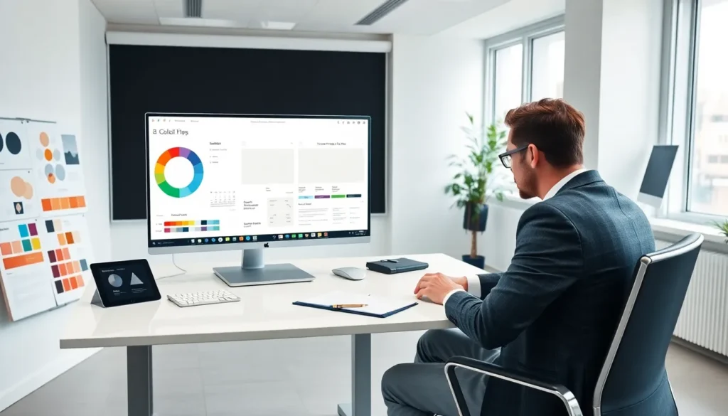
Table of Contents
ToggleStrong design concepts separate good work from forgettable work. Whether someone builds websites, creates marketing materials, or designs apps, these principles guide every decision. Top design concepts act as a shared language among creatives. They help teams communicate ideas clearly and solve visual problems efficiently.
This article covers six essential design concepts. Each one plays a specific role in creating effective, engaging visuals. Mastering these ideas gives designers a foundation they can apply to any project.
Key Takeaways
- Top design concepts like balance, hierarchy, and contrast form the foundation for creating effective, engaging visuals across any project.
- Balance distributes visual weight to guide the eye naturally—squint at your design to quickly spot uneven weight distribution.
- Hierarchy directs attention to key information first; without it, designs become visual noise where nothing gets remembered.
- Contrast improves readability and accessibility, with WCAG recommending at least a 4.5:1 contrast ratio for normal text.
- White space increases reading comprehension by up to 20% and signals sophistication in design.
- Consistency in fonts, colors, and styling builds trust and makes designs feel professional and cohesive.
Balance and Visual Weight
Balance refers to how elements distribute across a design. Every shape, color, and text block carries visual weight. Designers arrange these elements to create stability or intentional tension.
Two main types of balance exist: symmetrical and asymmetrical. Symmetrical balance mirrors elements on either side of a center line. It feels formal and orderly. Think of a wedding invitation with centered text. Asymmetrical balance uses different elements of varying weights to achieve equilibrium. A large image on one side might balance with several smaller text blocks on the other.
Visual weight depends on several factors. Darker colors feel heavier than lighter ones. Large objects carry more weight than small ones. Textured areas draw more attention than smooth surfaces.
Top design concepts like balance affect how users experience a page. Unbalanced designs feel uncomfortable. They make viewers work harder to process information. Balanced layouts guide the eye naturally and keep audiences engaged longer.
Here’s a practical tip: squint at a design to blur the details. This technique reveals the overall weight distribution quickly. If one area dominates unfairly, adjustments are needed.
Hierarchy and Emphasis
Hierarchy tells viewers what matters most. It creates a reading order and directs attention to key information first. Without hierarchy, designs become visual noise.
Designers establish hierarchy through size, color, position, and spacing. The largest element typically gets noticed first. Bold or bright colors stand out against muted backgrounds. Items placed at the top or center of a layout receive more attention.
Emphasis works hand-in-hand with hierarchy. It highlights specific elements that require immediate attention. A call-to-action button, for example, needs emphasis to drive clicks. Designers might use contrasting colors, larger sizes, or surrounding white space to make that button pop.
Consider newspaper layouts as classic examples of hierarchy. Headlines dominate the page in large, bold type. Subheadlines provide secondary information in smaller text. Body copy appears smallest, for those who want full details.
These top design concepts apply directly to digital interfaces. Users scan websites in predictable patterns. They expect important information at the top. They look for visual cues about what to read next. Effective hierarchy respects these behaviors and delivers content in digestible chunks.
A common mistake is making everything feel equally important. When nothing stands out, nothing gets remembered.
Contrast and Color Theory
Contrast creates visual interest and improves readability. It occurs when elements differ significantly from each other. Light versus dark. Large versus small. Smooth versus textured.
Color contrast deserves special attention. Dark text on light backgrounds remains the gold standard for readability. But contrast goes beyond black and white. Complementary colors, those opposite each other on the color wheel, create strong contrast. Blue and orange. Red and green. Purple and yellow.
Color theory provides a framework for making smart color choices. The color wheel organizes hues into primary, secondary, and tertiary categories. Understanding relationships between colors helps designers build palettes that work.
Warm colors (reds, oranges, yellows) advance visually. They feel energetic and attention-grabbing. Cool colors (blues, greens, purples) recede. They create calm, professional atmospheres.
Top design concepts like contrast also affect accessibility. Low-contrast text frustrates users with visual impairments. Web Content Accessibility Guidelines recommend a contrast ratio of at least 4.5:1 for normal text. Tools like WebAIM’s contrast checker help designers verify their choices.
Contrast isn’t limited to color. Typography offers contrast through weight, style, and size. Mixing a bold sans-serif headline with a light serif body creates visual variety while maintaining readability.
White Space and Minimalism
White space, also called negative space, is the empty area around and between elements. Many beginners fear it. They want to fill every pixel. But white space is a powerful design tool.
White space improves comprehension. Studies show that proper use of white space between lines and paragraphs increases reading comprehension by up to 20%. It gives content room to breathe. It reduces cognitive load.
Minimalism embraces white space as a core principle. This design approach strips away unnecessary elements. Only essential components remain. Apple’s product pages exemplify minimalist design. Large images. Short text. Generous margins. Nothing competes for attention.
But minimalism doesn’t mean boring. Strategic use of white space draws focus to what matters. A single bold headline surrounded by emptiness commands attention more effectively than the same headline crowded by competing elements.
These top design concepts require restraint. Designers must resist the urge to add more. Every element should earn its place. If something doesn’t serve a purpose, it should go.
White space also signals sophistication. Luxury brands use it extensively. Think of high-end fashion magazines versus discount store flyers. The difference often comes down to breathing room.
Unity and Consistency
Unity ties a design together. It makes separate elements feel like parts of a whole. Without unity, designs look scattered and unprofessional.
Consistency creates unity. Using the same fonts, colors, and styling throughout a project establishes visual cohesion. When buttons look identical across all pages, users learn what to expect. When headings follow the same format, content becomes predictable in a good way.
Repetition reinforces consistency. Repeating visual elements, icons, shapes, color accents, creates rhythm and recognition. Brand guidelines exist specifically to ensure consistency across all touchpoints.
Alignment also contributes to unity. Elements that share a common edge or center line appear connected. Grids help designers maintain alignment across complex layouts. They provide invisible structure that users feel even if they don’t consciously notice.
Top design concepts like unity apply at every scale. A single poster needs internal consistency. A brand identity needs consistency across thousands of applications. The principle remains the same.
Inconsistency breaks trust. If a website uses three different button styles, users wonder if they’re on the same site. If a presentation mixes random fonts, the content feels careless. Consistency signals professionalism and attention to detail.


