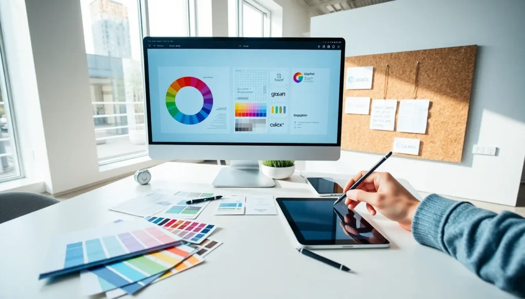
Table of Contents
ToggleA solid design concepts guide helps creators build visuals that communicate clearly and connect with audiences. Whether someone designs websites, marketing materials, or social media graphics, understanding core design principles separates amateur work from professional results.
Good design doesn’t happen by accident. It follows specific rules that guide how elements interact on a page or screen. These principles help viewers process information quickly and feel the right emotions. This guide covers the essential design concepts every creator needs to master, from balance and hierarchy to color theory and typography.
Key Takeaways
- A design concepts guide helps creators build professional visuals by mastering fundamentals like unity, contrast, repetition, alignment, and proximity.
- Balance (symmetrical, asymmetrical, or radial) and visual hierarchy control where viewers look first and how comfortable a composition feels.
- Color theory and typography carry emotional weight—choose palettes and fonts that match your brand personality and audience expectations.
- Apply design concepts consistently by starting with a clear goal, building a style guide, and testing with real users.
- White space supports hierarchy by giving important elements room to breathe, preventing designs from feeling cluttered.
- Iterate and refine your work—strong designers revise multiple times until balance, hierarchy, and details work together seamlessly.
Understanding the Fundamentals of Design
Design fundamentals form the building blocks of every visual project. These core concepts appear in logos, websites, posters, and product packaging. Learning them creates a foundation for making smart creative decisions.
The first fundamental is unity. Every element in a design should feel like it belongs together. Creators achieve unity through consistent colors, shapes, and spacing. When a design lacks unity, it feels scattered and confusing.
Contrast draws attention to important elements. Placing light against dark, large against small, or rough against smooth creates visual interest. Contrast helps guide viewers to key information first.
Repetition builds consistency and strengthens brand recognition. Using the same fonts, colors, and graphic elements across materials creates a cohesive look. This design concept helps audiences recognize and remember a brand.
Alignment organizes content so it appears intentional. Even small misalignments can make a design look unprofessional. Strong alignment creates clean sight lines that guide viewers through the content.
Proximity groups related items together. Items placed close to each other seem connected, while items spaced apart feel separate. This simple design concept organizes information without adding extra visual elements.
Balance and Visual Hierarchy
Balance and visual hierarchy control how viewers experience a design. These design concepts determine where eyes travel first and how comfortable the overall composition feels.
Types of Balance
Symmetrical balance mirrors elements on either side of a center line. This creates formal, stable compositions. Corporate logos and traditional wedding invitations often use symmetrical balance.
Asymmetrical balance distributes visual weight unevenly but still feels stable. A large image on one side might balance against several smaller text blocks on the other. This approach feels more dynamic and modern.
Radial balance arranges elements around a central point. Think of a sunburst or a circular logo. This style draws attention to the center and creates energy.
Creating Visual Hierarchy
Visual hierarchy tells viewers what to look at first, second, and third. Designers control hierarchy through size, color, placement, and contrast.
The most important element should be the largest or most visually distinct. Headlines typically appear bigger than body text for this reason. Buttons that need clicks often use bright colors to stand out.
Placement also affects hierarchy. Items at the top of a page or in the center receive more attention. Viewers in Western cultures tend to scan from left to right, top to bottom, a pattern called the F-pattern or Z-pattern depending on the layout.
White space (or negative space) supports hierarchy by giving important elements room to breathe. Crowded designs make everything compete for attention, which weakens the overall message.
Color Theory and Typography Basics
Color and typography carry emotional weight in any design. These design concepts influence how audiences feel about a brand or message before they read a single word.
Color Theory Essentials
The color wheel organizes colors into primary (red, yellow, blue), secondary (orange, green, purple), and tertiary hues. Understanding these relationships helps creators build harmonious palettes.
Complementary colors sit opposite each other on the wheel. Red and green, blue and orange, these combinations create high contrast and grab attention. They work well for calls to action but can feel overwhelming if overused.
Analogous colors sit next to each other on the wheel. Blue, blue-green, and green create calm, unified palettes. These schemes feel harmonious and are easy on the eyes.
Triadic colors form a triangle on the wheel. This approach offers variety while maintaining balance. Many sports teams use triadic schemes.
Color psychology matters too. Blue suggests trust and calm. Red creates urgency and excitement. Yellow feels optimistic. Green connects to nature and growth. Smart designers match color choices to brand personality and audience expectations.
Typography Fundamentals
Typography affects readability and mood. Serif fonts (with small decorative strokes) feel traditional and trustworthy. Sans-serif fonts look modern and clean. Script fonts add elegance but can be hard to read at small sizes.
Most designs work best with two or three fonts maximum. Pairing a bold headline font with a simple body font creates contrast without chaos. Consistent font sizing establishes clear hierarchy between headings, subheadings, and paragraphs.
Line spacing (leading) and letter spacing (tracking) also affect readability. Tight spacing can feel cramped, while generous spacing improves comprehension, especially on screens.
Applying Design Concepts to Your Projects
Knowing design concepts is only half the equation. Applying them consistently produces better results across every project.
Start with a clear goal. Every design should solve a problem or communicate a specific message. Define the purpose before choosing colors, fonts, or layouts. A poster promoting a music festival needs a different approach than a law firm’s website.
Gather inspiration, but don’t copy. Study designs that work well in similar contexts. Note what makes them effective, then create something original. Platforms like Dribbble, Behance, and Pinterest offer endless examples.
Build a style guide. Document the fonts, colors, and spacing rules for each project or brand. This reference keeps designs consistent and speeds up future work.
Test with real users. Show designs to people outside the project. Fresh eyes catch problems creators miss. Ask testers where they look first and whether the message comes through clearly.
Iterate and refine. First drafts rarely hit the mark. Strong designers revise multiple times, adjusting balance, hierarchy, and details until everything works together.
These design concepts apply whether someone creates print materials, digital interfaces, or social content. The principles stay constant even as trends change.


