Table of Contents
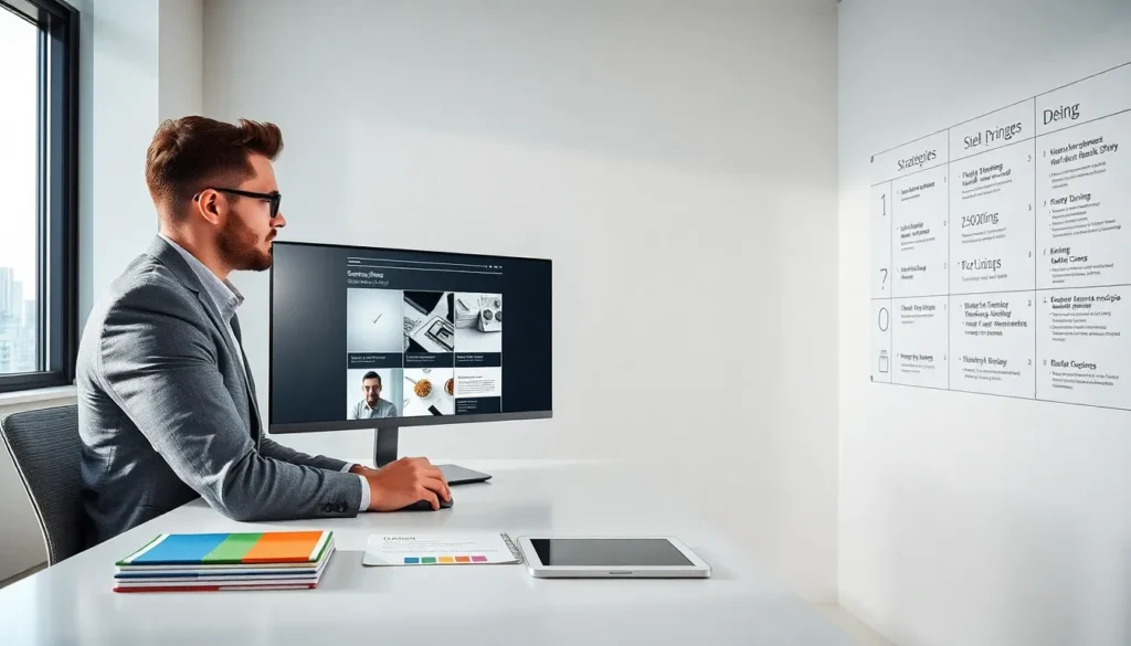
ToggleDesign concepts strategies shape how audiences perceive and interact with visual content. Strong design does more than look good, it communicates, guides, and converts. Whether building a website, crafting a brand identity, or developing marketing materials, the right approach makes the difference between forgettable and memorable.
This guide breaks down the core principles behind effective design. It covers practical strategies for modern projects, explains how to balance beauty with usability, and shows how these ideas translate across different formats. Designers at any level will find actionable insights here.
Key Takeaways
- Effective design concepts strategies combine six core principles: balance, contrast, hierarchy, alignment, repetition, and proximity.
- Always start with research and design mobile-first to ensure clarity and prioritization across all screen sizes.
- Limit your color palette and typography choices to create stronger brand identity and visual consistency.
- Balance aesthetics with functionality—usability should come first, but visual appeal keeps users engaged.
- White space, accessibility, and fast load times are essential for designs that perform well and serve all users.
- Adapt your design approach to each medium (web, print, social, environmental) while maintaining consistent foundational principles.
Understanding Core Design Principles
Every successful design starts with foundational principles. These aren’t arbitrary rules, they’re patterns that reflect how humans process visual information.
Balance creates stability in a composition. Symmetrical layouts feel formal and orderly. Asymmetrical arrangements add energy and interest while still feeling intentional. A landing page might use symmetrical balance for a corporate feel, while an art portfolio could lean asymmetrical to suggest creativity.
Contrast draws attention and establishes hierarchy. Light against dark, large against small, rough against smooth, these differences tell viewers where to look first. Without contrast, designs feel flat. Too much creates chaos. The goal is intentional emphasis.
Hierarchy organizes information by importance. Headlines sit larger than body text. Primary buttons use bolder colors than secondary ones. Good hierarchy means users don’t have to think about what matters most, the design tells them.
Alignment connects elements visually. Random placement makes designs look accidental. Strategic alignment creates invisible lines that guide the eye and suggest relationships between components.
Repetition builds consistency. Using the same fonts, colors, and spacing patterns throughout a project creates cohesion. It also makes production faster once systems are established.
Proximity groups related items together. Contact information clustered in one area reads as a single unit. Scattered across a page, it becomes harder to find and use.
These design concepts strategies work together. A skilled designer applies them instinctively, adjusting each element until the whole feels right.
Essential Design Strategies for Modern Projects
Principles provide the foundation. Strategies determine how to apply them in real work.
Start with research. Before opening any design software, understand the audience, competitors, and project goals. A design for teenagers looks different from one targeting executives. Research prevents wasted iterations.
Design mobile-first. Most web traffic now comes from phones. Starting with the smallest screen forces clarity and prioritization. Scaling up to desktop feels natural. Scaling down from desktop often creates cramped, confusing layouts.
Use grids consistently. Grid systems speed up decision-making and create visual rhythm. A 12-column grid works for most web projects. Print designers might prefer different column counts based on format.
Limit your palette. Fewer colors create stronger identity. Many successful brands use just two or three primary colors. Add neutrals and one accent for variety without confusion.
Choose typography with purpose. Each typeface carries personality. Serif fonts suggest tradition and authority. Sans-serif feels modern and clean. Script fonts add elegance but hurt readability in body text. Limit projects to two or three font families maximum.
Create reusable components. Design systems save time and ensure consistency. Button styles, card layouts, and icon sets that repeat across a project make updates easier and reduce errors.
Test with real users. Assumptions fail. Actual users reveal problems designers miss. Even informal feedback sessions catch major issues before launch.
These design concepts strategies apply across industries. The specifics change, but the approach stays constant: research, systematize, test, refine.
Balancing Aesthetics and Functionality
Pretty designs that don’t work frustrate users. Functional designs that look terrible don’t get used. The best work achieves both.
Usability comes first. A contact form that looks beautiful but confuses visitors fails its purpose. Designers must fight the urge to prioritize style over clarity. Every decorative element should support, not hinder, the user’s goal.
Constraints breed creativity. Limited budgets, tight timelines, and brand guidelines force innovative solutions. Designers who embrace constraints often produce better work than those with unlimited freedom.
White space is active. Empty areas aren’t wasted space. They give content room to breathe and help important elements stand out. Cramming in more stuff usually makes everything less effective.
Accessibility expands reach. Design concepts strategies that consider color blindness, screen readers, and motor impairments serve more people. They also tend to improve usability for everyone. High contrast helps users with low vision and users in bright sunlight.
Performance affects experience. A gorgeous website that loads slowly drives visitors away. Optimized images, efficient code, and smart asset loading keep experiences fast. Sometimes the best design choice is the simpler one that loads in half the time.
Trends fade: clarity lasts. Chasing every new style creates dated work. Core principles endure. A clean, well-organized design from 2015 often ages better than a trendy one from last year.
The tension between aesthetics and functionality isn’t a problem to solve, it’s a balance to maintain throughout every project.
Applying Design Concepts Across Different Mediums
Good design concepts strategies translate across formats, but each medium has unique requirements.
Web design prioritizes interaction and responsiveness. Buttons need hover states. Layouts must adapt to countless screen sizes. Load times and performance matter as much as visuals.
Print design demands attention to physical production. CMYK color profiles, bleed areas, paper stock choices, these technical details determine whether the finished piece matches the vision. What looks right on screen may print differently.
Brand identity requires systematic thinking. Logos must work at tiny sizes on business cards and huge sizes on billboards. Color systems need to function in full color, single color, and reversed applications. Flexibility matters.
Social media graphics live in fast-scrolling feeds. Bold visuals, minimal text, and instant comprehension win attention. Subtle designs get scrolled past. Platform dimensions and safe zones change frequently.
Presentation design supports speakers rather than replacing them. Slides stuffed with text force audiences to choose between reading and listening. The best presentations use visuals that complement spoken words.
Environmental design considers physical space and human movement. Signage must be readable at distance. Wayfinding systems guide without overwhelming. Materials, lighting, and durability all factor in.
Experienced designers adapt their approach to each medium while maintaining consistent principles. The fundamentals stay the same. The execution changes based on context, audience, and technical constraints.


